Ylopo’s Mission Control redesign
Simplifying Marketing dashboard for real estate agents to encourage more campaign launching habits
Ylopo is a digital marketing and lead generation platform. A comprehensive digital marketing and lead generation platform specifically built for real estate teams and brokerages, combining AI-powered advertising technology with advanced lead nurturing capabilities. While the platform is currently inefficient for Real estate team owners due to complex structure of the dashboard, the Ylopo team also wanted to introduce the portal to real estate agents working with owners.
This project was designed and researched with the team me taking up the tasks related to product discovery, user interviews, while the team focused on the visual design and creating a design system for the platform
aligning with the brand identity.
Product designer
8 Members
2 Product Managers
1 Engineer
Aug - Dec 2024

Context
Role
Team
Timeline
SUMMARY
Quickly and reliably find listings, launch in One click
We decided to focus on the Campaign launching flow to be more efficient and create the dashboard for the agents access, as the Ylopo’s mission control currently has an existing dashboard that team owners have access to, but has structure issues. This product redesign case study thoroughly documents the research, analysis and design process of the solution, It highlights the process used to solve the user problem strategically, the design decisions made, an analysis of the knowledge and research, sketching of the idea and development of the prototype based on multiple iterations and user testing results.
Simply, it answers the questions that motivate each process and action, that eventually led to the agents portal in Ylopo’s Mission control.
IDEA SYNTHESIS
THE PROBLEM
It all started when we began to articulate the complexity of the existing dashboard
Too many semi-functional page sections increases friction for teams to find information and updates about campaigns.
Among the team members that we spoke with, 15+ stakeholders to understand their workflows, pain points, and expectations. additionally after a thorough design audit of the existing Mission Control platform, analyzing user interactions and system architecture, we were told that the interface does not only needs a visual improvement but also corrections on a deeper level.
The current solution used by many real estate teams to manage their campaigns and business has its own downsides. While the only benefit being familiar with the terms on dashboard. Having many semi-functional sections and pages also forced agents to “bounce off” of the platform and take updates outside the platform in-person.
Why was the platform not used enough?
Talking to 15+ team member from different departments and reviewing the existing platforms gave us valuable insights. The stakeholders and users mentioned many issues, each with distinct pain points.


Inconsistent and constrained filter option
Multiple nested tabs = difficult to understand the hierarchies in this section

Confusing sectioning
Inconsistent design patterns
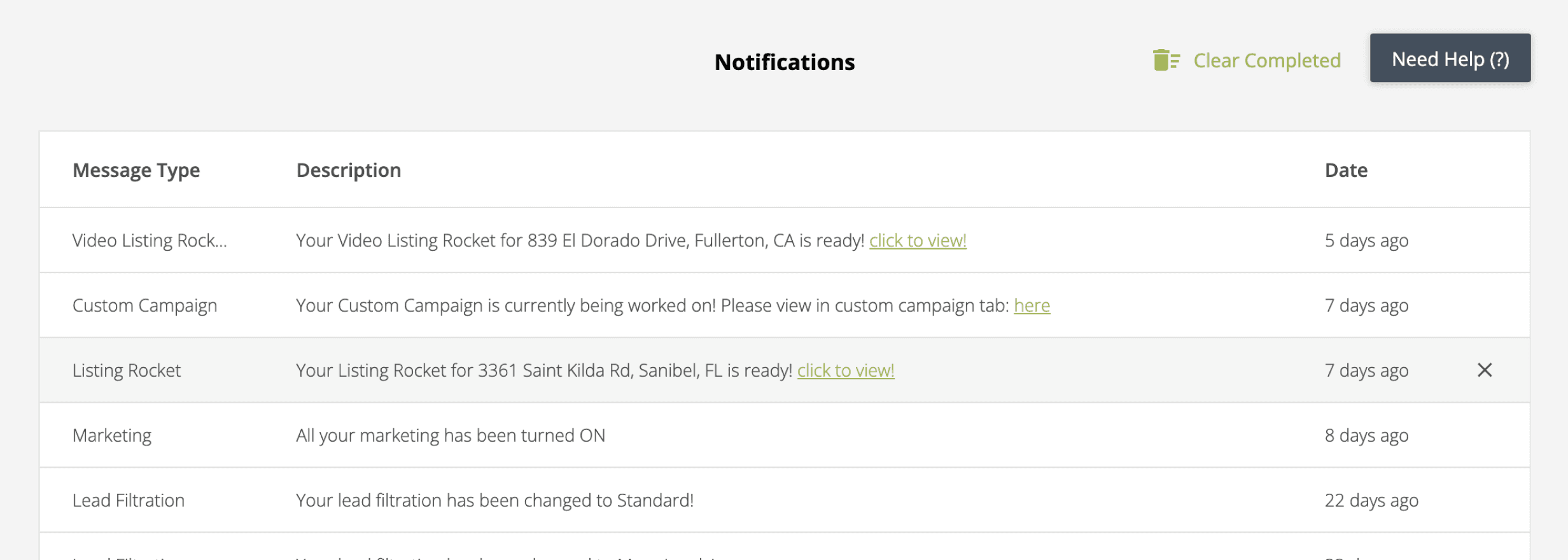
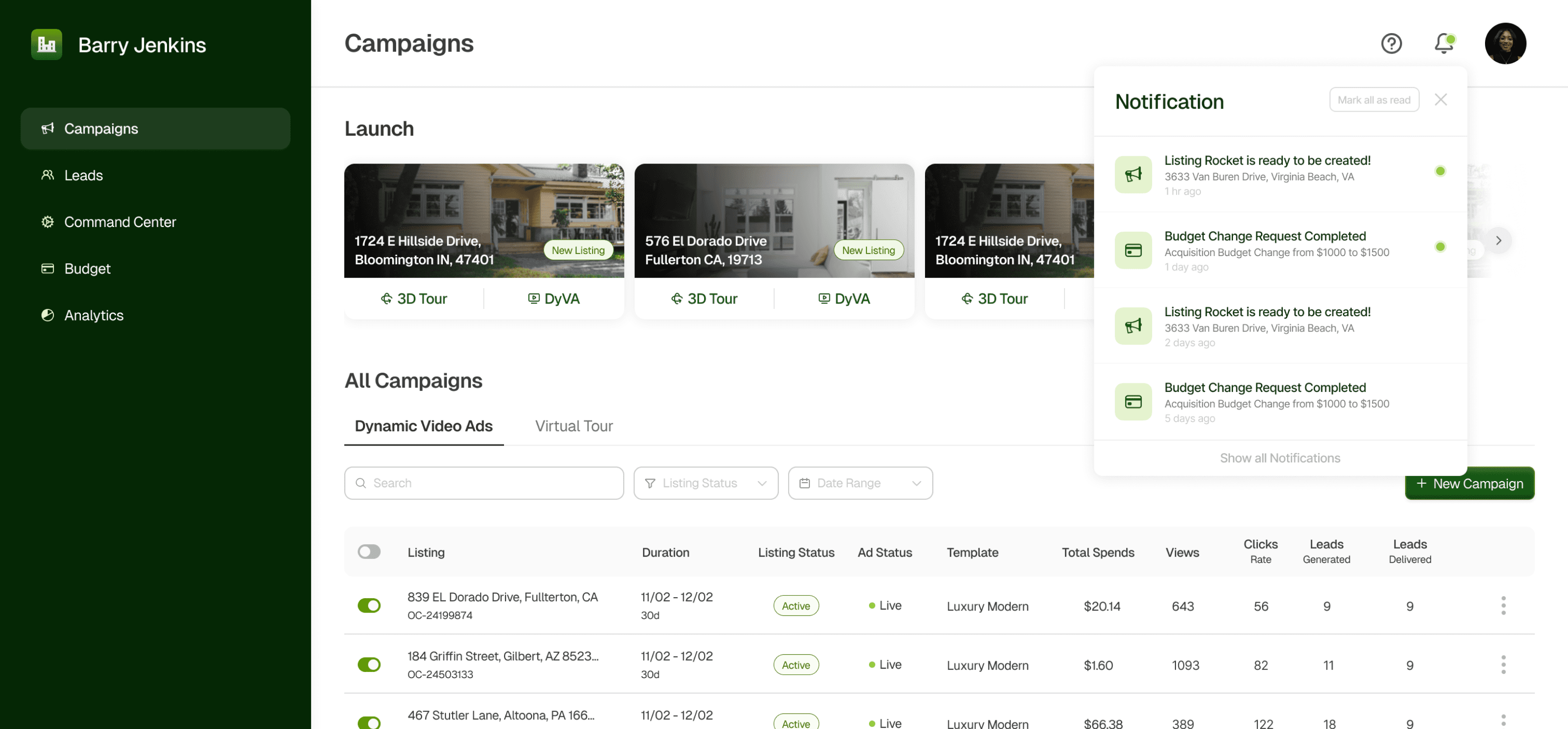
Notification as a section in the page
Mission Control usage
While the users stated that it is manageable and is found user-friendly, some users may need more time to fully understand all the features and metrics with the dashboard. Only functions that the users used it only to launch a Dyva ad and simply download the seller report. They were not able to track progress.
inconsistent
visual hierarchy
Information overload
Limited navigation
VISUAL DESIGN IDEATION
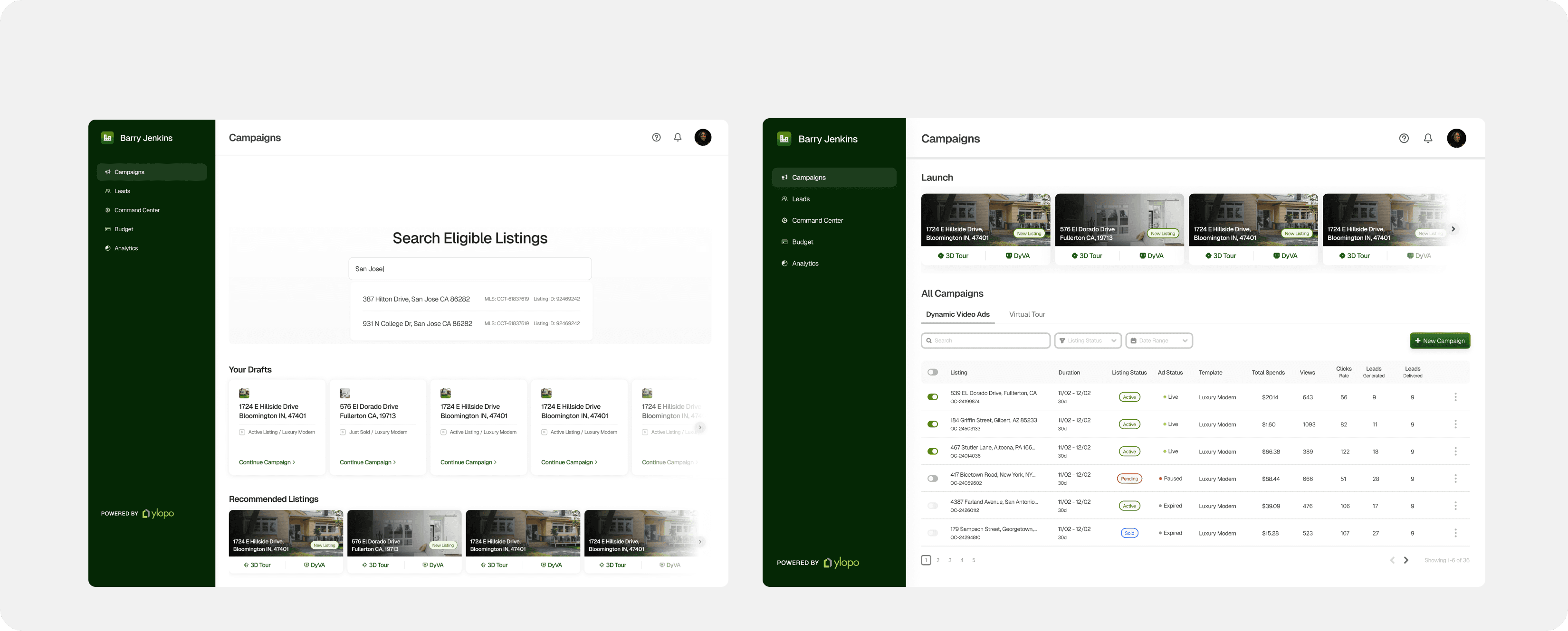
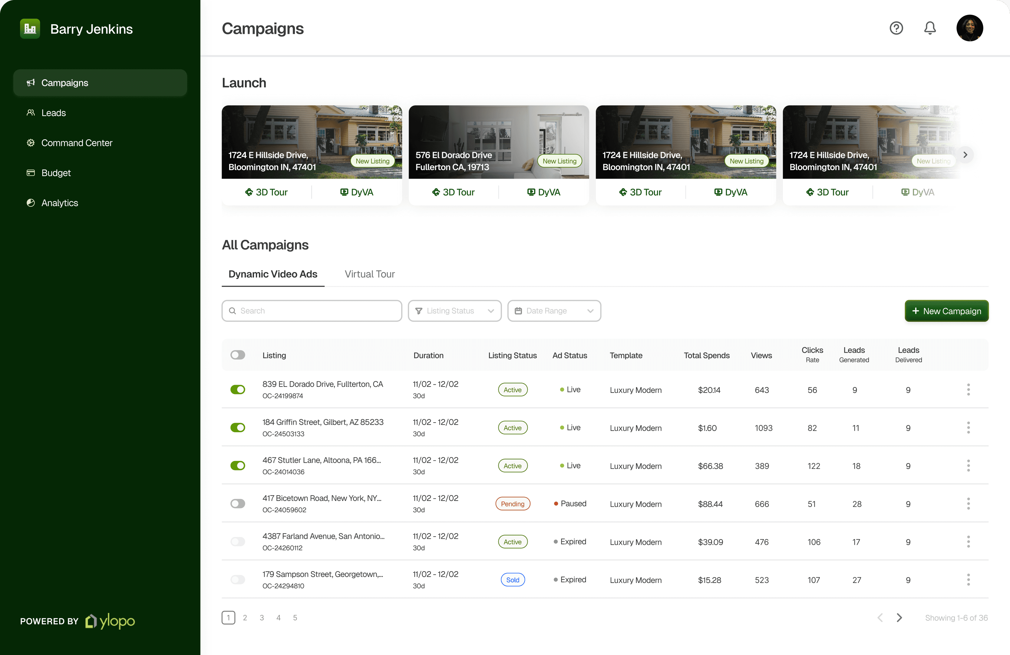
We wanted to help create a campaign creation dashboard where the real estate teams can effortlessly find campaign listings available, and conveniently set up the campaign to launch for themselves. To where Ylopo’s Mission control now becomes accessible for the team agents and is more intuitive with clear hierarchy and status updates.
The new listing cards display the basic informations about the listing’s locations before clicking on the agent’s preferred type of Campaign type. These play a dominant role in shaping the visual experience and aligns with ylopo’s intention to encourage the real estate teams to find more listings conveniently.
The card chosen properly displayed the hierarchy of information from Top to bottom making the card easier to scan while having plenty of space for longer listing details. It checked all the requirements while being space efficient.
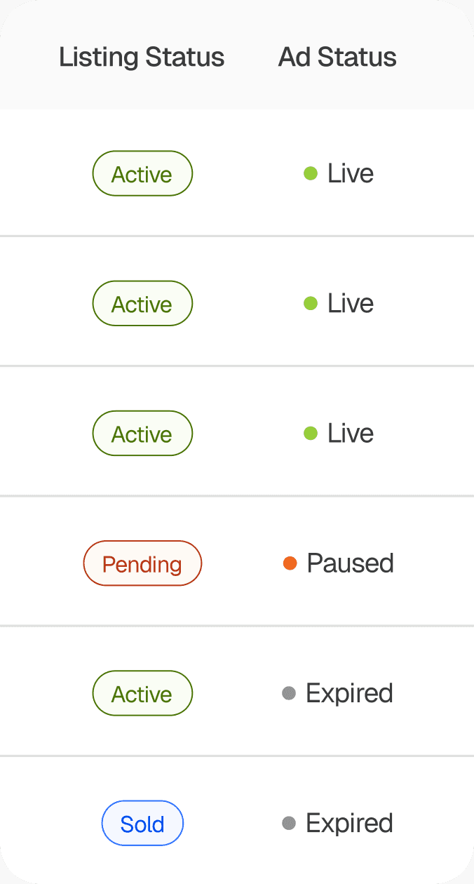
Initially, we had 2 distinct icon and color tags to indicate the status of campaigns launched . We soon realised after card sorting that users have different ideas when it comes to categorising statuses. W e then decided to go with a action based color for universal clarity.
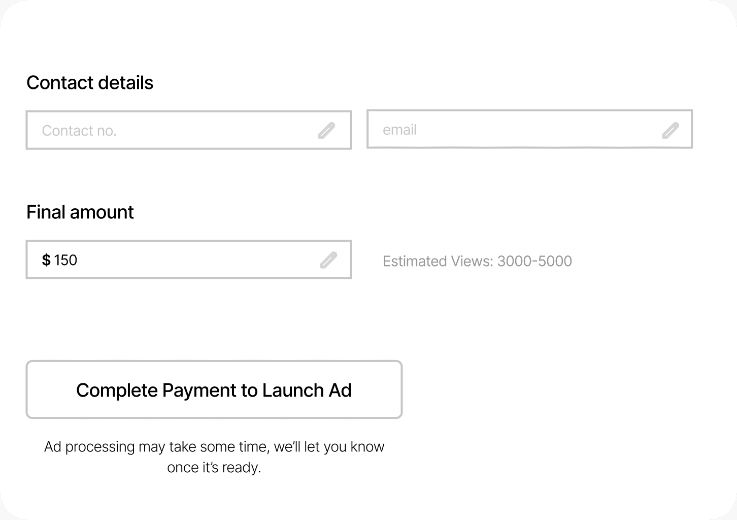
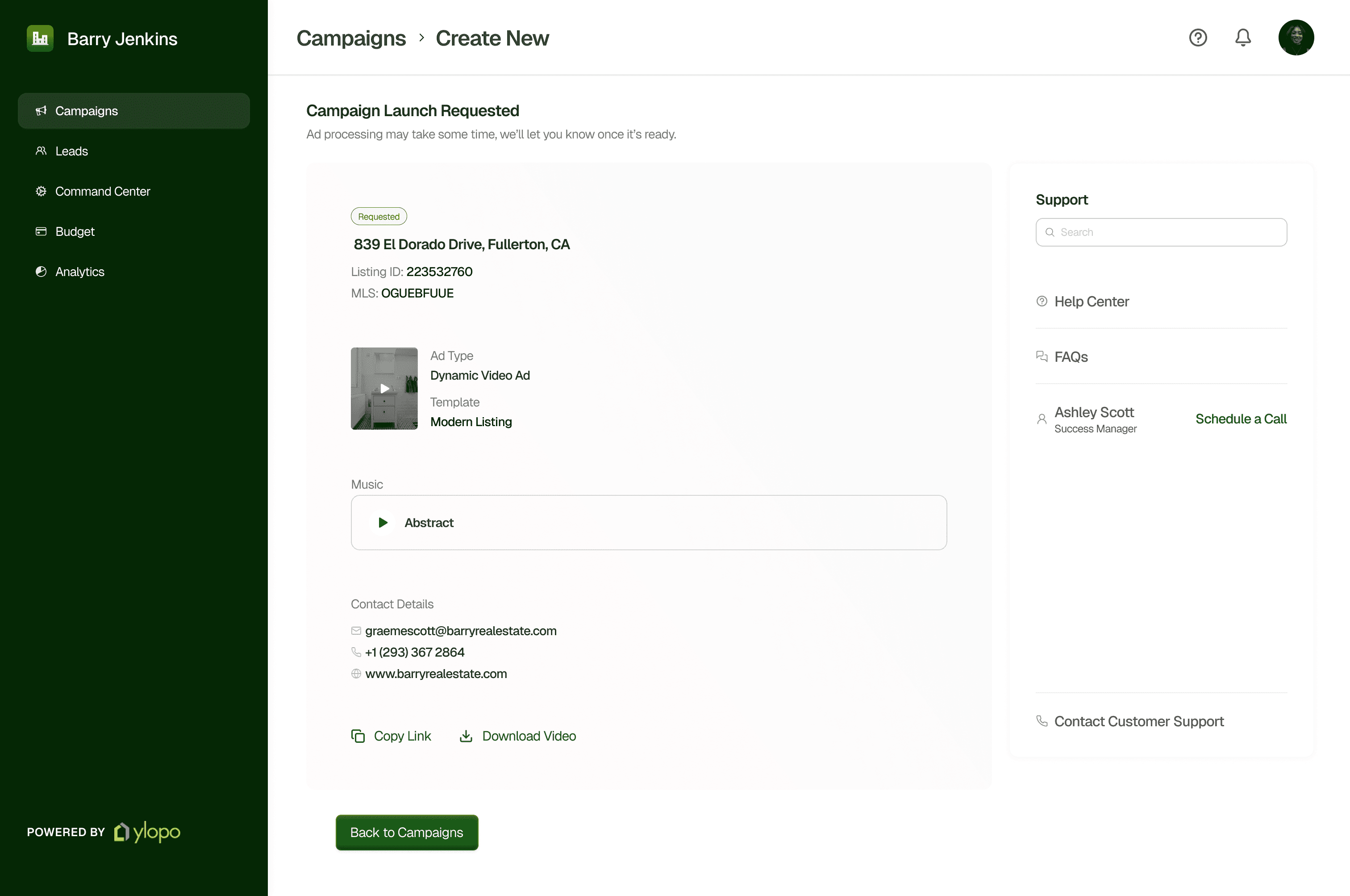
As we were working towards the creating a campaign page, we quickly realised to have a progress flow at the top to keep the agents aware of the details they have to address to finally launch the campaign, with that came the responsibility to not the payment completion feel too instructive but also have clear transparency about the amount and mode of payment.
PRODUCT GOAL
Launch a campaign in fewer clicks
Crafting the Campaign listing page
Choosing the core layout
Color and Icon distinction = Confusion
Simplifying payment flow

FINAL DESIGN
Small + Listing details on Top
FINAL DESIGN
Action specified color tags
FINAL DESIGN
Upfront payment mode visibility

ITERATION 1
Medium + Listing details at the bottom
ITERATION 1
Feels more instructive to complete the payment
ITERATION 2
Additional click to edit the payment mode
ITERATION 2
Large + listing details at the bottom
ITERATION 1
Combination of icons and colors
ITERATION 2
Distinct color tags


New Listing
1724 E Hillside Drive, Bloomington IN, 47401
3D Tour
DyVA
1724 E Hillside Drive, Bloomington IN, 47401
3D Tour
DyVA

New Listing


When clicking on the Launch listings car, we had multiple options to display to choose the options for preferred mode of campaigns. Anew loaded page or an option to display it in the cards to help make quick decisions.
Maximising campaign management efficiency
FINAL DESIGN
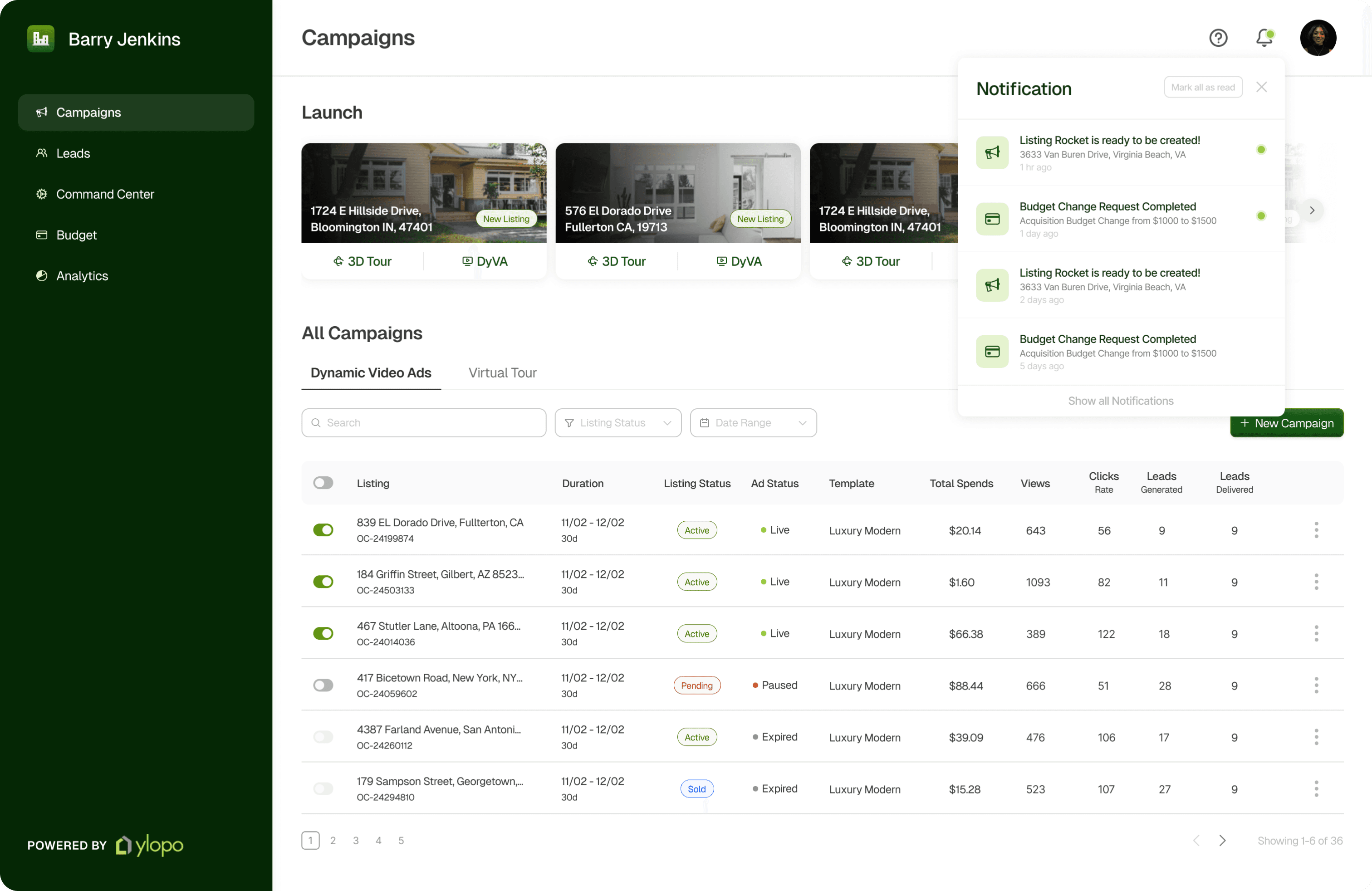
Optimizes real estate through 3-dot icons to access reports and has the ability to switch campaigns on/off through the toggle


ITERATION 1
Unclear priority indicators and pausing / resuming ad that assist in decision making at a glance are set apart
ITERATION 2
Actions like “View ad”, “seller report” and “leads” are aligned with corresponding campaign, but requires most of the real estate.
INTERACTION DESIGN IDEATION
While the previous interface preferred a top navigation bar to encourage exploration to find the right information, we realized that the decrease in quality of user experience was not a worthy tradeoff. Adding the left-sided navigation section increased page accessibility and efficient sectioning within the main headings while increasing vertical screen real estate. Keeping the filter tabs on top provided a middle ground for exploration.
Being the core interaction point, the goal was to create a dashboard that maximized page search flexibility while encouraging camoaign management and creation meet alll levels of business goals.
Page Orientation
Optimizing page visibility and function
FUNCTIONAL DESIGN IDEATION
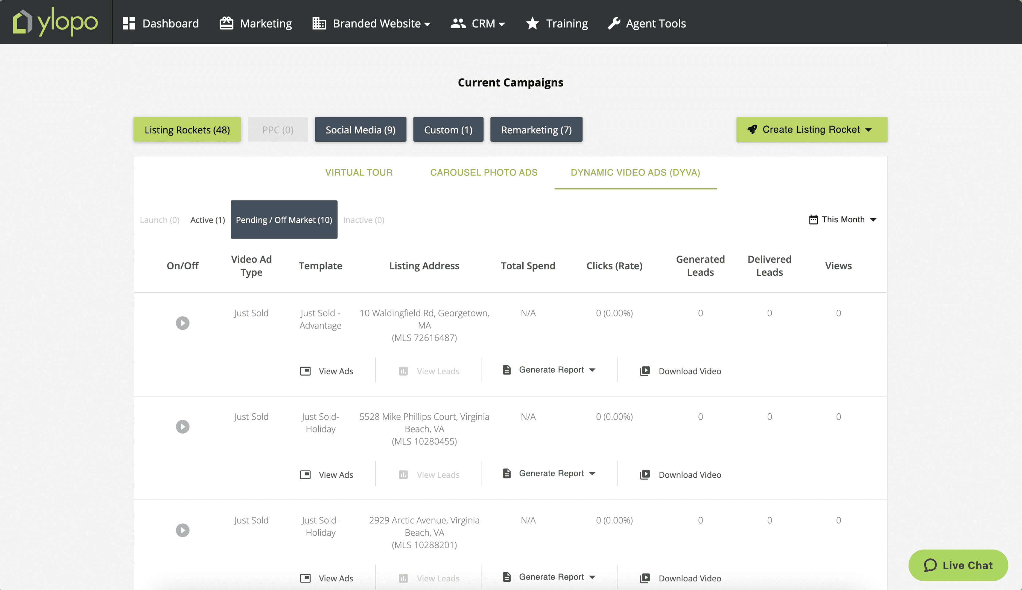
EXISTING DASHBOARD
With the primary user base being real estate team agents who are working under one specific team owner, we wanted to encourage them to discover new listings to create campaigns for and also stay updated about the campaigns they run.
How can we create a environment that keeps agent on top of their campaign statuses?
GRANULAR DESIGN DECISIONS
GRANULAR DESIGN DECISIONS
We wanted to introduce the ability to immediately narrowing a search to a very specific status of their listings.
Filter statuses

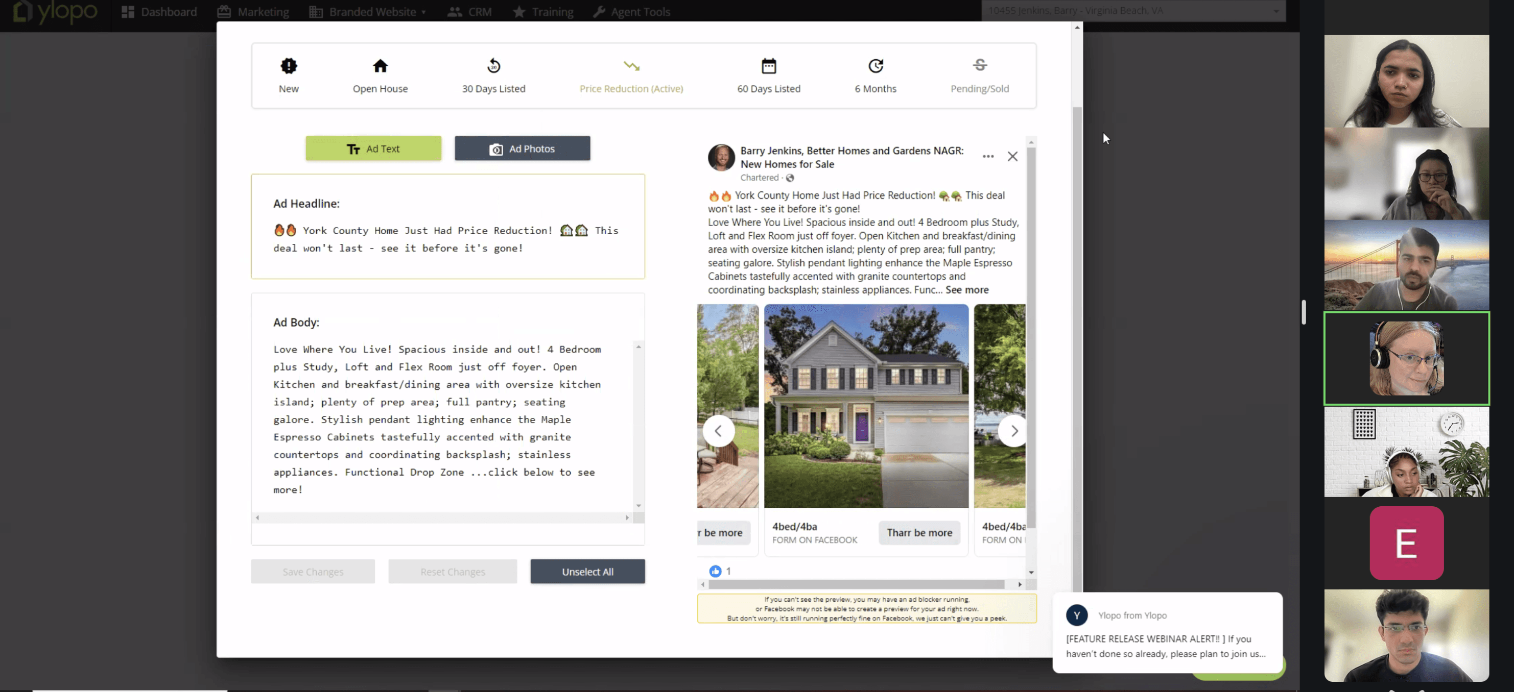
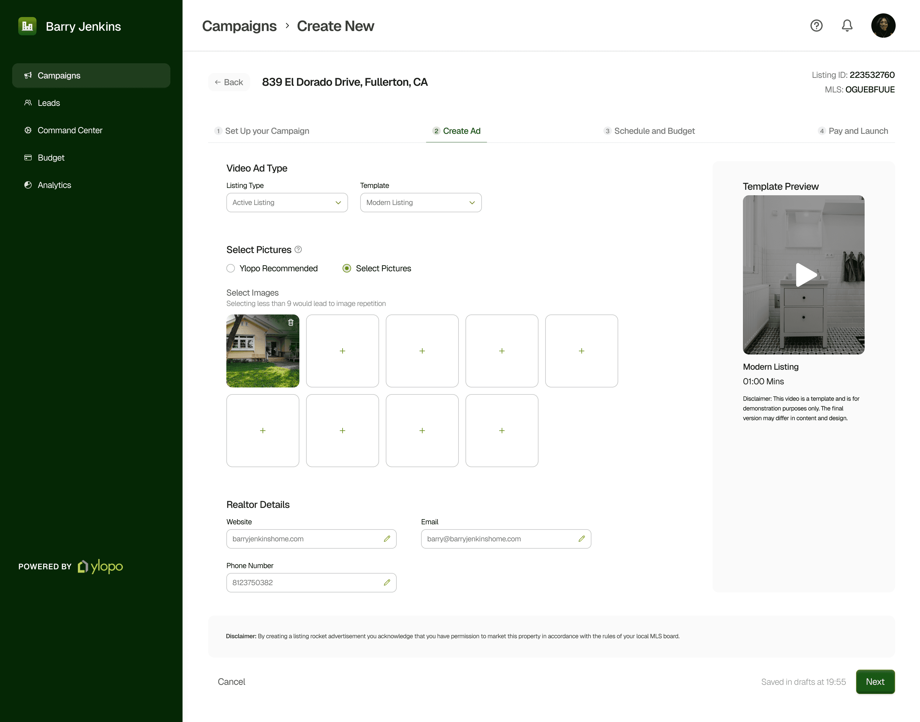
Through exploring the existing dashboard, and conducting a design audit to analyse the gaps that were leading to friction in the user experience of creating a campaign, we quickly realised the small pop-up modal would not let the agents to have a visual preview of the templates to make a decision on which one to select and would let the users to go through multiple clicks to finally select the preferred one.
Previewing templates

EXISTING DASHBOARD

HUMAN CHALLENGES
How can we alleviate the anxiety of missing an update?
An MVP ready for development
REFLECTIONS AND RESULTS
Details are time consuming
Present for feedback
Scope creep hinders MVP development
FINAL DESIGNS
HUMAN CHALLENGES
Opening with a discover page tailored to search for eligible listings opens to the opportunity to also introducing adjacently similar and recommended listings for agents to check out. The page refreshes to always introduce new and recommended listings
Many Team owners found it difficult to know when the ads were ready, for every update they would have to connect with the marketing team to status updates. While ideating a solution, we focused on one with the highest effectiveness and the lowest effort for implementation.
Discover Page
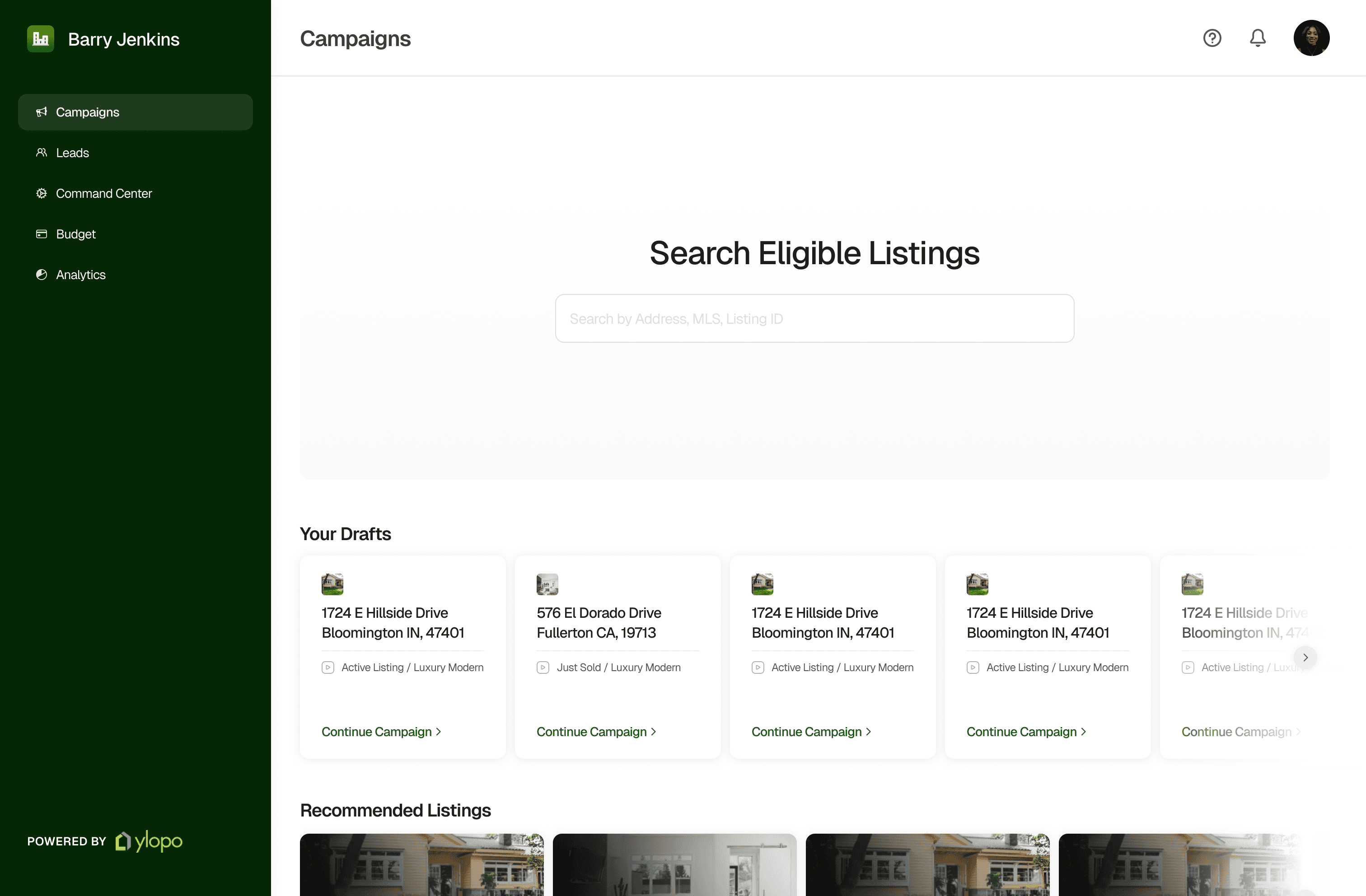
Simply search, save and create campaigns that match the teams interest.
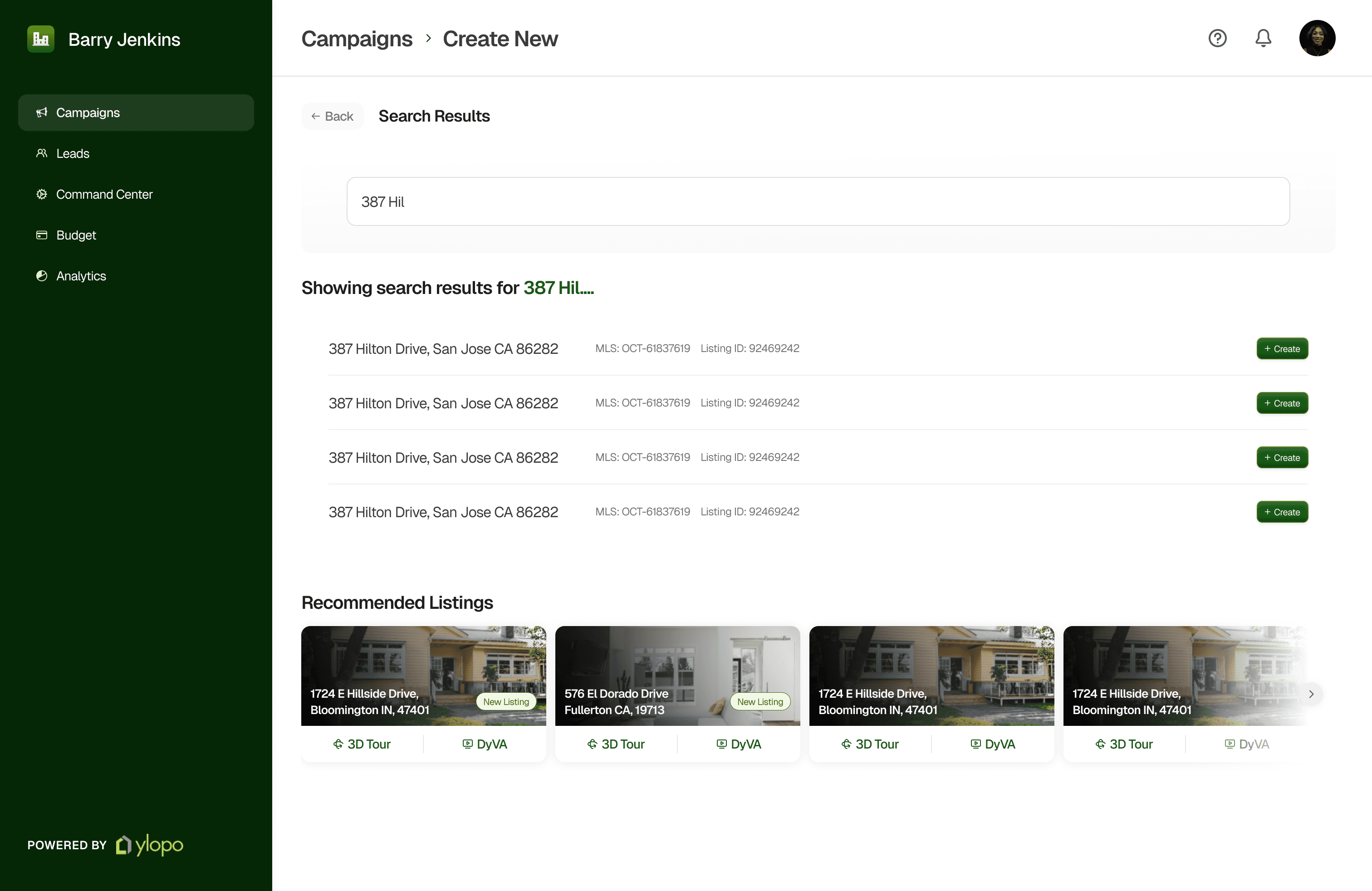
Simplified creation of campaign with a template preview for more intuitive experience.
Find status updates about the campaigns run by the agents themselves.
Stay informed about the progress and support.
With the command center, Campaigns listing page and campaign creation process completed, it was time to handover the documentation to the team for development and launch.
The details will often take a long time, think about the 80/20 rule. It is best to design for the whole story first and worry about the details later.
The goal of a presentation isn’t just to inform what you’ve been up to. It is also to receive the right type of feedback by guiding the audience towards a specific focus.
There were tons of features brainstormed that kept on pushing a structured design approach. For an MVP, limiting the scope early will save time in the long run.
FINAL DESIGNS
Looking for my next design Challenge
Thanks for reaching the bottom of this page. If you like what you see, let's connect and build something together!.
Let’s make an impact
Contact me